This is just awesome. brilliant use of cut scenes.
Are you DTF?
OKCupid Redefines DTF.
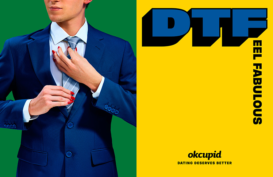
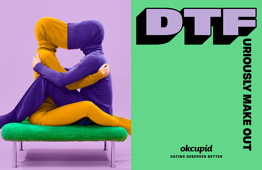
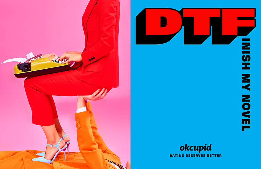
The dating site rethinks that blunt old acronym, originally meaning “down to fuck,” by making it the centerpiece of a new campaign from Wieden + Kennedy New York—with the F word replaced by dozens of enlightened alternatives, leading to phrases like “down to feel fabulous,” “down to forget our baggage” and “down to fight about the president.”
The point being: Dating can and should be about more than hookups. The tagline is, “Dating deserves better.”
The headlines are matched with fun, brightly colored photographs. Several of the ads also have a political message, adding to the already provocative use of “DTF” as a theme. It’s a highly artistic campaign, too—W+K worked with artist Maurizio Cattelan and photographer Pierpaolo Ferrari, the creators of Toilet Paper magazine, on the ads.
The campaign marks the latest attack on dating culture, which has come to seem dehumanized in the binary, swipe-left-or-right age of Tinder.
OkCupid CMO Melissa Hobley tells AdFreak that the new campaign signals the brand’s commitment to being focused on substance and depth, while also reflecting the issues and passions that people care about.
“In the current political and social climate, we felt a responsibility and saw an opportunity to play a part in changing the conversation about dating culture and empowering each individual to reclaim the meaning of DTF and make it theirs,”
OkCupid aims to achieve substance and depth through the app’s features. It asks users more than a dozen questions while setting up a profile and recently launched OkCupid Discovery, which lets users search by passions and interests. It aims to achieve relevance through the brand voice, having found traction by leaning into politics over the past year—including adding a “Trump Filter” to its list of questions.
The ads are aimed at anyone who wants to bring their full selves to dating. But Hobley says they may resonate especially with women, who are “aware that the phrase DTF was used historically in a negative way. There’s power in taking that back and making it yours.”
In terms of craft, the W+K creatives said the campaign is meant to feel playful and positive, as a counterpoint to where so much of the dating scene is headed.
“We set out to really explore what happened to chivalry and courtship and how modern-day dating seemed to be on a bad trajectory,” says copywriter Ian Hart. “When we say dating deserves better, what we’re really saying is people who date deserve better. Because I mean, they really do. Modern dating treats emotions like a disposable commodity. Anyone who’s been single knows this. It’s an aspiration to treating people like people.”
Hart says the campaign “is a celebration of who we are as individuals in the dating sphere—DTF celebrates what makes each of us unique. We needed the visuals to reflect this. Basically it’s sort of this ‘Imagine if dating were…’ thought that’s very playful and joyful. I think Maurizio and Pierpaolo’s work creates visuals that are, by very their nature, optimistic and pleasant, which allows the content matter to venture into a more surrealistic world without losing its positive message.”
My Thoughts...
I feel that this campaign really connects to millennials and gives it a refreshing colour and attitude towards online dating. The colours, photography and art direction really made the attitude and tone of voice of this idea come alive. Only issue is that I think it needs to be adapted into the Singapore lingo if its done here.
As Millennials are generation that are aren't afraid of being loud and opinionated, I think the way they re-defined the term DTF is fantastic and this example could really be a good reference for me to solve a brief by understanding the target audience's mindset and coming up with a strong insight that sets the structure for the idea.
Cheers,
Amos
Information source : Adweek, Tim Nuddjuxtaposition
Got inspired after helping out for RSAF pitch this week. Had some spare time at work and decided to play around with some images. Although this technique isn't new in advertising, it can be quite an effective tool to create something that visually stands out.
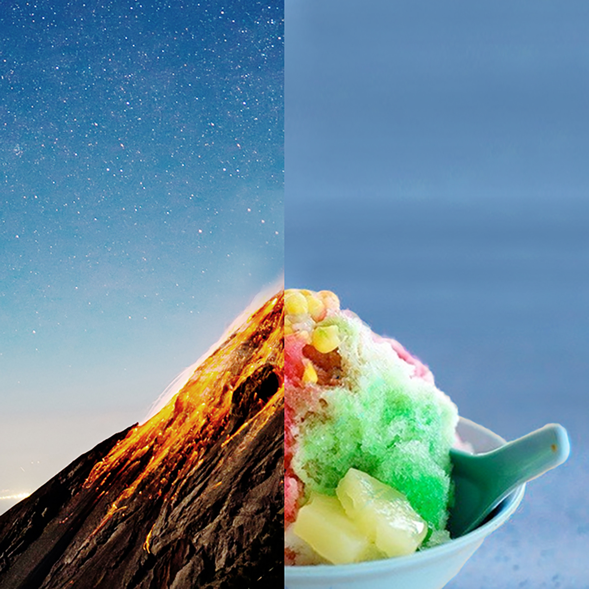
Juxtaposition is the placement of two or more things side by side, often in order to bring out their differences. Imagine a man walking a well-groomed dog on a pink leash on one hand and a rough Rottweiler on a spiked collar on the other hand. The juxtaposition could be shocking, humorous, or just plain strange. Regardless, this literary term calls attention to two distinctly different things by placing them right beside one another, or juxtaposing them.
I noticed that when using this technique, its visually more appealing to have both side of image sharing similar background colour.
When this is done, the whole image looks seamless.
Well, maybe in the future i can get the opportunity to use this technique paired with something modern and fresh to
create something visually stunning.
Illustration: Zach Meyer
HOW POKEMON GO BECAME A VIRAL HIT, AND THE KEYS TO ITS SUCCESS.
Yes, you're tired of hearing about Pokemon fans talking about the latest craze which is Pokemon Go. The phenomenon has swept the world at a record pace since its release on July 6. Some hate it as it endangers the users lives as they mindlessly walk onto traffic while others love it as it gets people gathering in common places across the country, hunting virtual characters with their phones.
Believe it or not, Pokemon Go could be the beginning of a shift in the way we advertise. Yes, it is bridging the gap between the online and offline experience and leveraging the latest augmented reality.
In a world where marketers are using hyper-targeted strategies to drive brand awareness and conversion from the "right" audience, it is hard to believe success can be found leveraging a generalized approach. Pokemon Go, the latest and greatest augmented-reality mobile application, became the most popular mobile app across generations, cultures, genders and race in less than a week. While it's difficult to predict the vitality and success of any content, we often find that the truly successful have many elements in common, and Pokemon Go has hit on all of them.
An Established Brand With An Emotional Connection
The Pokemon brand has been around for three decades and has adapted each iteration to the industry's latest gaming technology. Its adaptive nature has allowed Pokemon to shape a generational brand. At the core of any brand or campaign is an emotional connection, Some people have been fans for years while others, who loved Pokemon as kids, choose to play because it makes them nostalgic for their childhood.
Consumer Focused
It's a game that is accessible to anyone with a smartphone, and it's easy to use. The game is generally free and it encourages people to go outside and search.
Strong Visibility
You see them everywhere. Groups of people hunting Pokemon, eyes glued to phones. They are obvious because they are disrupting the normal course of daily human behavior. This naturally sparks interest, prompting observers to seek an explanation by searching or asking others, which causes a ripple effect of awareness for the app even on social media platforms.
Social element
It's incredibly social. Pokemon Go is bringing people together in the real (physical) world where they bond over a common interest. It's a welcome change from the walled social interactions online. Because it brings people together physically in a new situation, it has become ideal sharing material for social networks.
Headline-worthy
the biggest catapult to extreme vitality is that it's drawing major headlines on social networks and news outlets. We've seen news about Pokemon Go accidents, health benefits and robberies. The familiarity of the brand and chaos that has ensued has created perfect fodder for the media.
An Established Community
Having a fanatical fan base to start and continue the Pokemon Go conversation helped genuinely build the game's popularity rather than a celebrity-like influencers who has extensive reach but little credibility within the niche community. Brands should build a community of power fans who authentically seed new products or campaigns to help drive the awareness wildfire.
Displaces Multiple product benefits
Pokemon Go appeals to a large audience because it delivers on various user benefits—nostalgia, innovation, fitness, etc. Various points of resonance not only help grow a brand or product's potential audience, but also provide a well-rounded user experience.
This approach is new and unexplored, but Pokemon Go's explosive and broad success adds validity that cannot go unnoticed. Marketers and advertisers should evaluate if this approach is right for their brand based on the above criteria and test it on lower-priority products and campaigns to understand its true effect.
Cheers,
Amos C
Information source : Adweek, Marie Goldstein, Tod LoofbourrowCannes 2016
As a creative I believe that one important habit to keep is the willingness to learn and observe from people or works that are better than my own. By observing and exposing myself to these award winning ads ideas, I would be able to deconstruct and reflect on what makes that piece of work fantastic. The recent Cannes Lion awards are over and here are some of the ads that I personally liked and inspired me to create better campaigns and ideas.
Harvey Nichols "Shoplifters"
Agency: Adam&EveDDB
Everyone loves freebies, I mean who doesn't want a free give away? The campaign's insight is a statement that is so familiar to everyone and along with the way that this ad is crafted which is something never done before. The art direction of using raw and low budget looking found footage of shoplifters being caught stealing creates such a rich narrative. And because of this interesting style of storytelling, I guess most of the viewers want to know what happens to these shoplifters and the message behind this idea.
Under Armour|Rule Yourself|Michael Phelps
Agency: Droga5
Another fantastic idea that is shot perfectly with the right camera angles, color setting, song choice and a really powerful copy to convey the emotion of hardship and determination of a champion. This ad idea really shows that Legacies like his are built over a lifetime of commitment and determination. The powerful of emotional storytelling to effectively convey the emotion and message across to the audience is really strong in this campaign idea.
Shiseido Co., "High School Girl?"
Agency: Watts of Tokyo
Make up products are usually associated with beauty, flowers or women. And in this TVC, Watts of Tokyo really showed the power of make up by using school girls who are actually men that had a make over with Shiseido make up products. However I am curious why they chose the setting of a classroom with teenage girls. Are they targeting a younger target audience which are likely insecure with their looks and showing them that this product can really cover up/ beautify whatever they want? Never the less, this idea was really well done and wonderfully crafted.
Generation Beyond Mars Experience|Lockheed Martin
Agency: McCann New York
With the recent hype in 360 VR videos, It was obvious that this new technology would open up many more possibilities in the way ads can convey a message. McCann New York did showed the world with its "Generation Beyond Mars Experience" campaign video. As the next frontier in space exploration is Mars, It is key that we inspire the next generation of youths to live out their dreams and potential to achieve greatness. Just by using a normal school bus travelling along the usual neighborhood, McCann inspired everyone with the use of 306 VR in its video. The idea really gives the audience a "feel good" feeling as it is really innovative and inspiring challenging young children to dare to dream and achieve.
Survival Billboard|XBOX
Agency: McCann London
They that once in awhile and if you're lucky, you get to work on interesting and daring briefs by really fun clients. And one such example is the "Survival Billboard" for XBox in its launch of Rise of the Tomb Raider in the U.K. I guess this idea came from an insight that the generation of people now are usually interested in Live on going videos. And to add to the attractiveness of this campaign, users can decide what weather element they want the contestants to withstand, creating quite a sadistic stunt advertisement that turned out to be a success in gaining attention and curiosity.
So wish me luck, hopefully i get a chance to create something as awesome as these ad ideas!
Cheers,
Amos C
Ubin
Hands: Forming a Connection
A Genuine Connection
Experimental ad concept using hands to show how millennials are able to connect with each other through facebook.


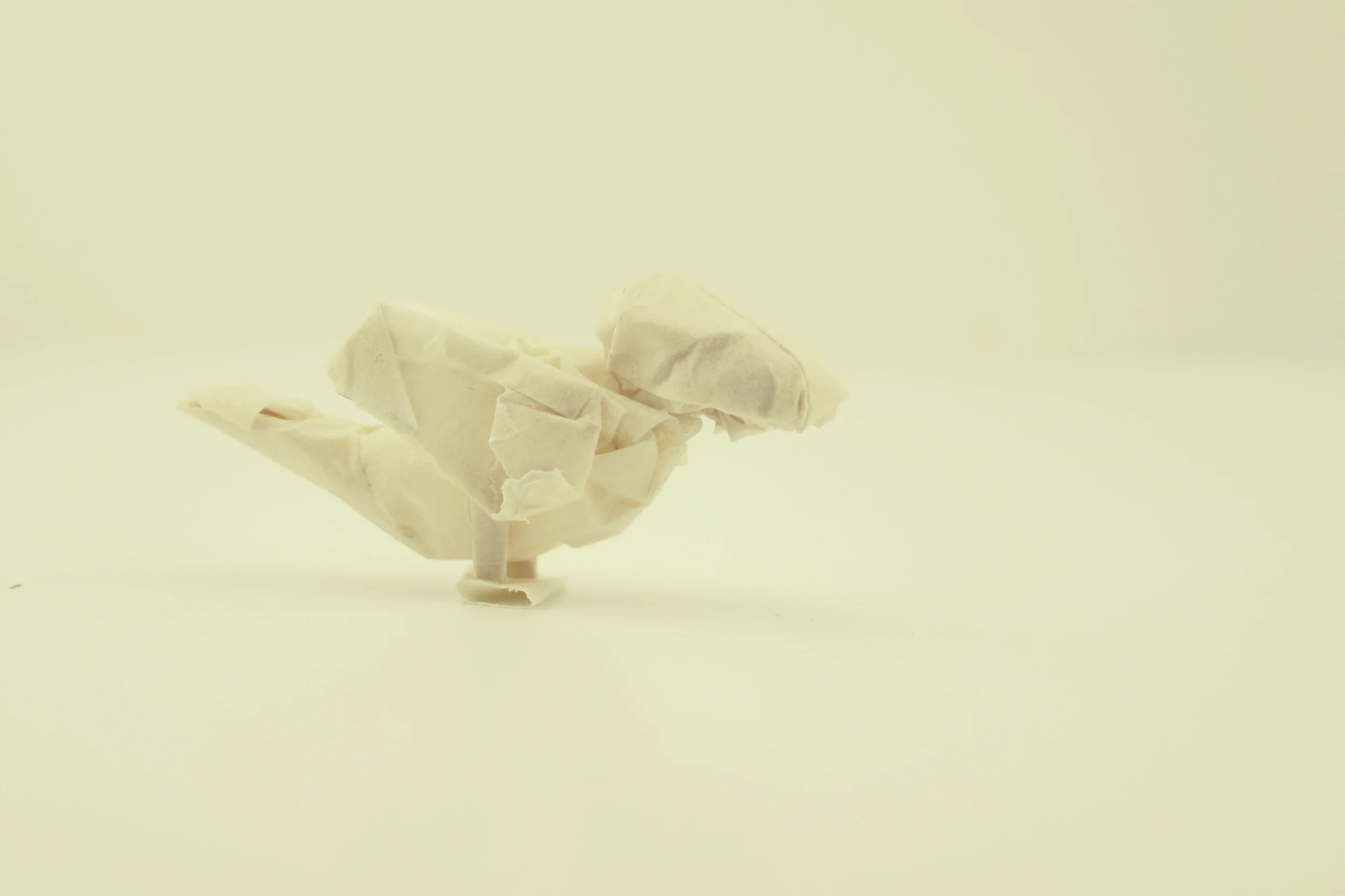
Simply Tape: Tape Making
Tape Making
"Tape Making" is the second part series project titled "simply tape". In this project, I wanted played with the function of masking tapes. A masking tape has a sense of humbleness and a “throwaway after use” nature, its color is plain and mundane but it is a essential item to me as a creative. In this project, i explore moulding the forms of used masking tape to create new forms where people can play with this material instead of just throwing it away.
Simply Tape: Memories Of A Roll Of Tape
Memories Of A Roll Of Tape
"Memories Of A Roll Of Tape" is part of a two part series project titled "simply tape". In this project, I wanted to play with something that designers/creatives use daily. In this mini project, i explored the ability of masking tapes being able to collect the texture of different surfaces that it was perviously stuck on.
In a way, after each tape is being peeled off, it becomes unique as it tells a story of where it has been before. In addition it also shows the adhesive strength of 3M's masking tape. So here's a summarized documentation of a collection of memories from a roll of tape.
