招き猫
Welcome to the Maneki Neko collection.
A contribution of varies artists from all over the world, asking them to share their vision of the famous cat's design, then using animation to bring all these designs to life.
Welcome to the Maneki Neko collection.
A contribution of varies artists from all over the world, asking them to share their vision of the famous cat's design, then using animation to bring all these designs to life.
Twentyfour Seven serviced the production Facebook's recent 'Community Matters' film with production company RESET and director Diego Contreras.
Facebook’s objective with this project was to create a film that evoked the feeling of community and the experience that comes with being part of something that’s bigger than one individual. It was essential that these videos had a feeling of being multicultural and the brief was to convey as many different communities and neighbourhoods as possible whilst not actually travelling the whole way around the world to do it! This project brought Diego Contreras of Reset Content to our doors and we gladly took on the challenge.
More works by Diego Contreras
Information source : LittleBlackBookThis is just awesome. brilliant use of cut scenes.

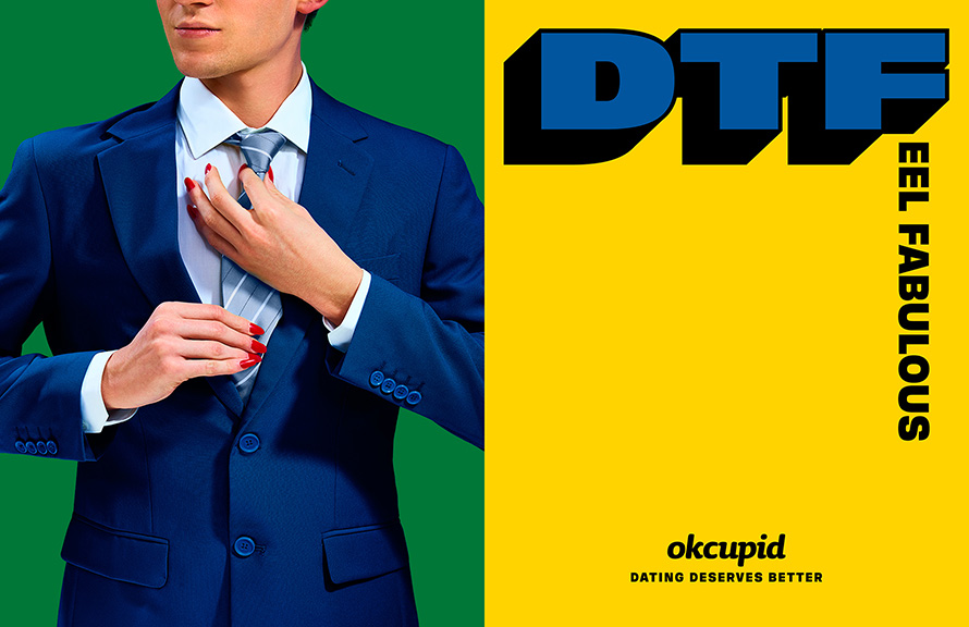
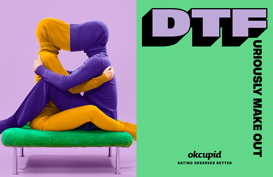
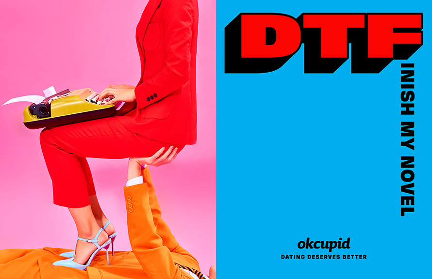
The dating site rethinks that blunt old acronym, originally meaning “down to fuck,” by making it the centerpiece of a new campaign from Wieden + Kennedy New York—with the F word replaced by dozens of enlightened alternatives, leading to phrases like “down to feel fabulous,” “down to forget our baggage” and “down to fight about the president.”
The point being: Dating can and should be about more than hookups. The tagline is, “Dating deserves better.”

The headlines are matched with fun, brightly colored photographs. Several of the ads also have a political message, adding to the already provocative use of “DTF” as a theme. It’s a highly artistic campaign, too—W+K worked with artist Maurizio Cattelan and photographer Pierpaolo Ferrari, the creators of Toilet Paper magazine, on the ads.
The campaign marks the latest attack on dating culture, which has come to seem dehumanized in the binary, swipe-left-or-right age of Tinder.
OkCupid CMO Melissa Hobley tells AdFreak that the new campaign signals the brand’s commitment to being focused on substance and depth, while also reflecting the issues and passions that people care about.

“In the current political and social climate, we felt a responsibility and saw an opportunity to play a part in changing the conversation about dating culture and empowering each individual to reclaim the meaning of DTF and make it theirs,”
OkCupid aims to achieve substance and depth through the app’s features. It asks users more than a dozen questions while setting up a profile and recently launched OkCupid Discovery, which lets users search by passions and interests. It aims to achieve relevance through the brand voice, having found traction by leaning into politics over the past year—including adding a “Trump Filter” to its list of questions.
The ads are aimed at anyone who wants to bring their full selves to dating. But Hobley says they may resonate especially with women, who are “aware that the phrase DTF was used historically in a negative way. There’s power in taking that back and making it yours.”

In terms of craft, the W+K creatives said the campaign is meant to feel playful and positive, as a counterpoint to where so much of the dating scene is headed.
“We set out to really explore what happened to chivalry and courtship and how modern-day dating seemed to be on a bad trajectory,” says copywriter Ian Hart. “When we say dating deserves better, what we’re really saying is people who date deserve better. Because I mean, they really do. Modern dating treats emotions like a disposable commodity. Anyone who’s been single knows this. It’s an aspiration to treating people like people.”


Hart says the campaign “is a celebration of who we are as individuals in the dating sphere—DTF celebrates what makes each of us unique. We needed the visuals to reflect this. Basically it’s sort of this ‘Imagine if dating were…’ thought that’s very playful and joyful. I think Maurizio and Pierpaolo’s work creates visuals that are, by very their nature, optimistic and pleasant, which allows the content matter to venture into a more surrealistic world without losing its positive message.”
I feel that this campaign really connects to millennials and gives it a refreshing colour and attitude towards online dating. The colours, photography and art direction really made the attitude and tone of voice of this idea come alive. Only issue is that I think it needs to be adapted into the Singapore lingo if its done here.
As Millennials are generation that are aren't afraid of being loud and opinionated, I think the way they re-defined the term DTF is fantastic and this example could really be a good reference for me to solve a brief by understanding the target audience's mindset and coming up with a strong insight that sets the structure for the idea.
Cheers,
Amos
Information source : Adweek, Tim NuddGot inspired after helping out for RSAF pitch this week. Had some spare time at work and decided to play around with some images. Although this technique isn't new in advertising, it can be quite an effective tool to create something that visually stands out.
Juxtaposition is the placement of two or more things side by side, often in order to bring out their differences. Imagine a man walking a well-groomed dog on a pink leash on one hand and a rough Rottweiler on a spiked collar on the other hand. The juxtaposition could be shocking, humorous, or just plain strange. Regardless, this literary term calls attention to two distinctly different things by placing them right beside one another, or juxtaposing them.
I noticed that when using this technique, its visually more appealing to have both side of image sharing similar background colour.
When this is done, the whole image looks seamless.
Well, maybe in the future i can get the opportunity to use this technique paired with something modern and fresh to
create something visually stunning.